Re-Architecting GoCrisp.com: A UX-Led Website Overhaul for Strategic Alignment & Engagement
The GoCrisp.com website had become outdated with its evolving business model, target audiences, and product offerings. Over the past couple of years, the website has been stripped down to a basic “Book a Demo” CTA, missing key engagement paths and a clear articulation of value. With recent acquisitions and an expanded product portfolio, GoCrisp needed a full website re-architecture that could scale, inform, and convert across diverse audiences. As the UX strategist and designer, I led a comprehensive audit and redesign initiative aimed at improving site architecture, navigation, messaging, and user engagement.
Challenge
The website and marketing team faced significant challenges stemming from rapid business growth, product evolution, and multiple acquisitions, which left the site outdated, misaligned with sales messaging, and difficult to navigate. Core issues included fragmented architecture, unclear user pathways, and a lack of engagement opportunities, resulting in low session duration, high bounce rates, and poor alignment between web experience and customer needs. The challenge was not just redesigning pages, but rethinking the site's role in the business strategy.

Process
Research
Reviewed internal documentation, past audits, and prior redesign feedback
Conducted a holistic evaluation of the existing site
Developed a universal UX/UI checklist with key focus areas (navigation, content, accessibility, architecture)
Coordinated stakeholder interviews and built a moderator guide

Audited 100+ pages for usability, architecture, and consistency
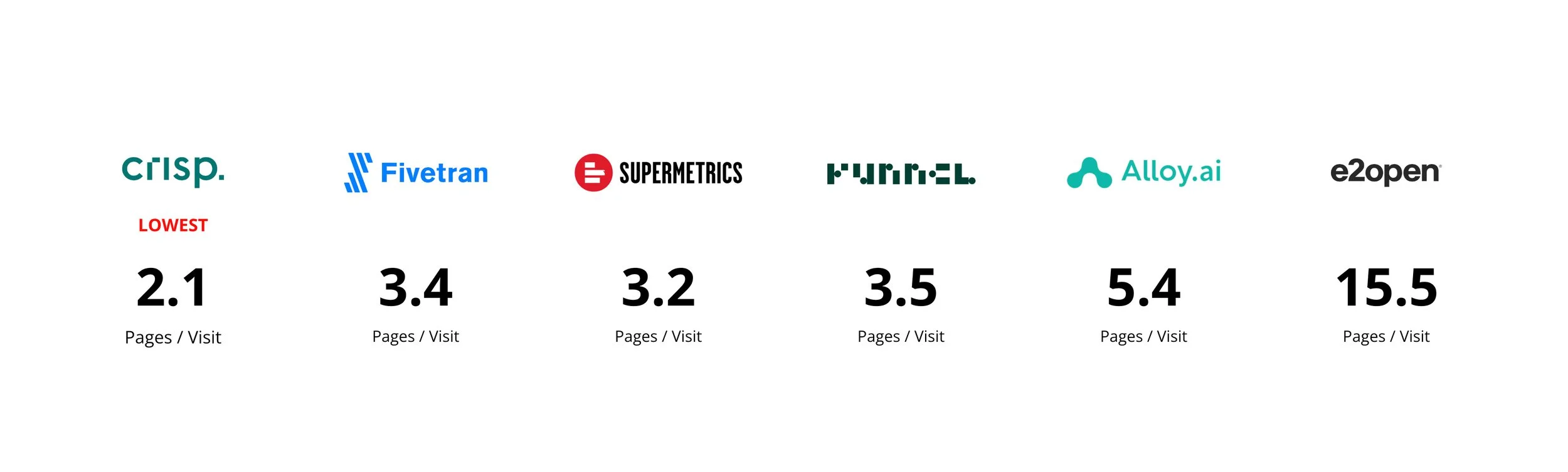
Reviewed Google Analytics data to evaluate bounce rate, session duration, and page flow
Conducted competitive analysis of solution and product pages
Synthesized feedback from CMO, CEO, and other stakeholders to align strategic vision
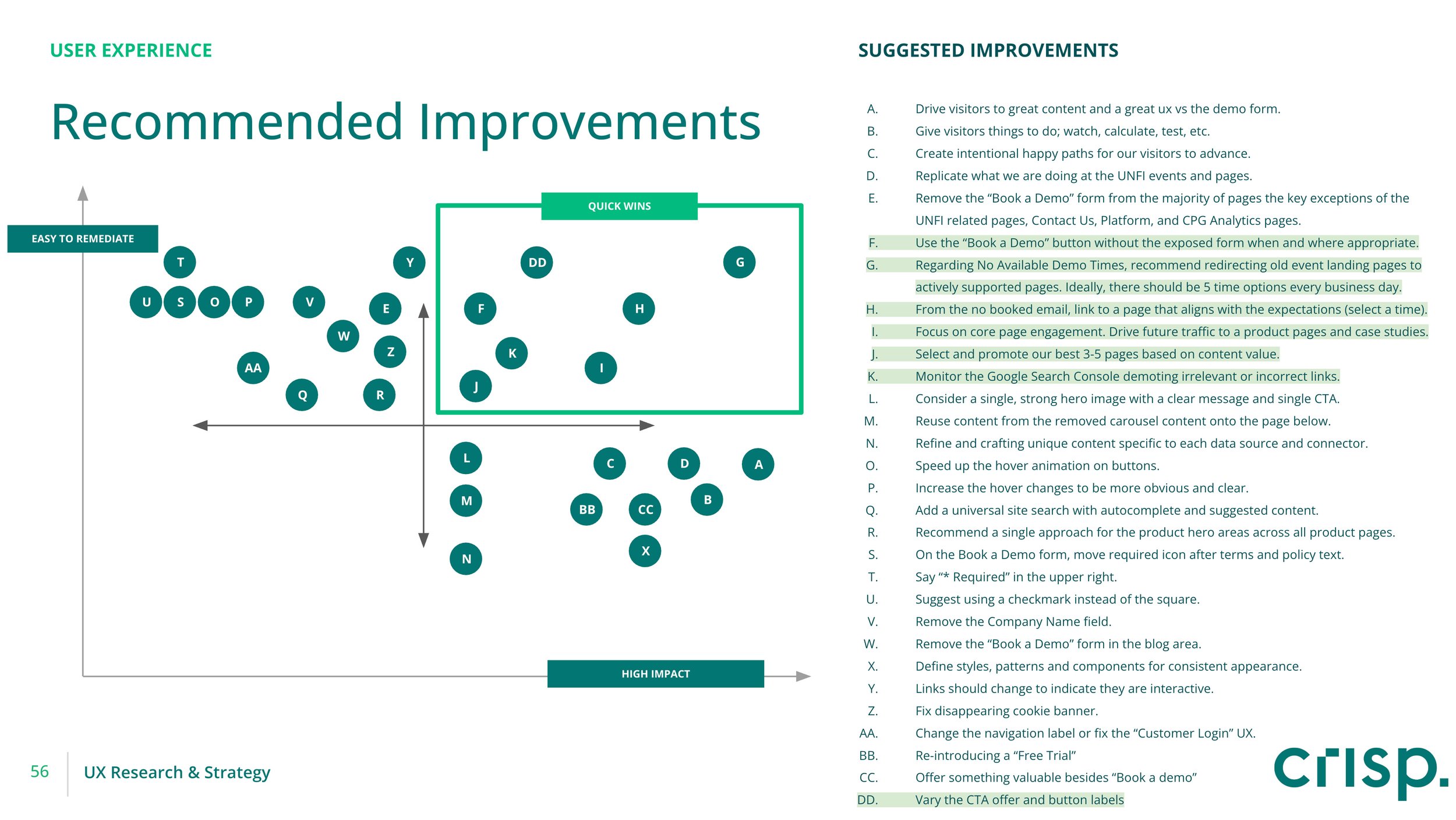
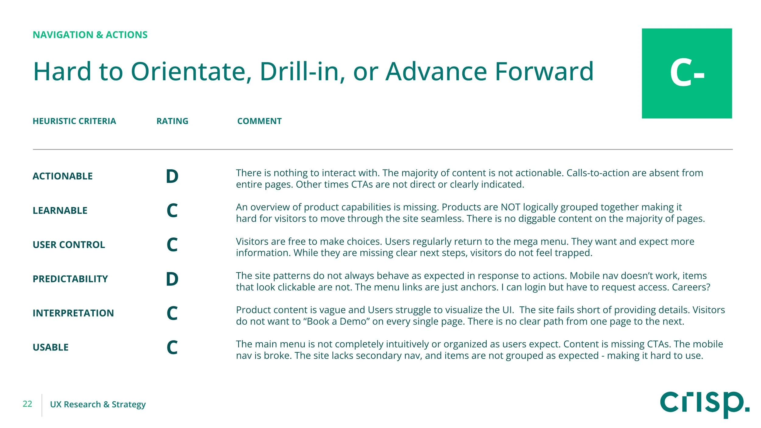
Delivered comprehensive website audit with 128+ prioritized recommendations, spanning: Navigation & Actions, Architecture & Structure, User Experience, Visual UI, Content & Voice, and Technical Implementation
Stakeholder insights summary with full video and transcript archive
Design
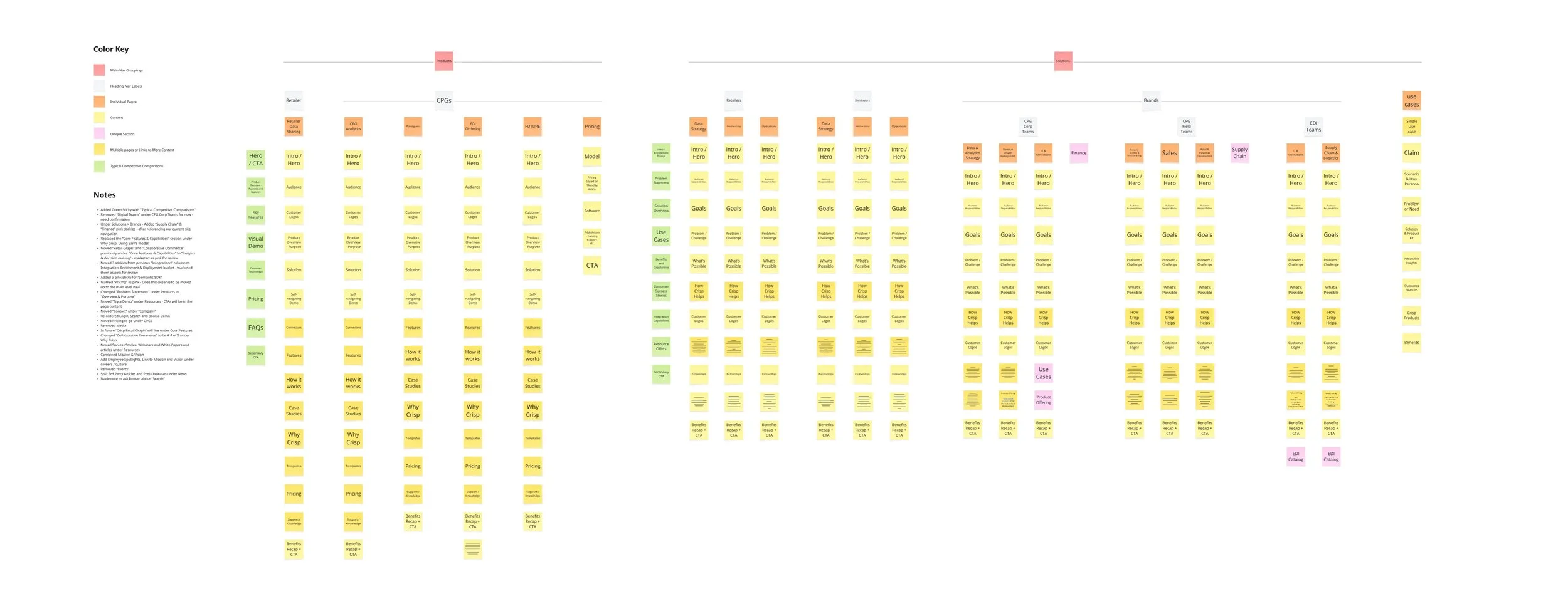
Created a sitemap and visual desktop navigation model to reframe site structure
Mapped page types and content blocks to support scalable growth
Produced wireframes and outlines
Evaluated and evolved existing block patterns to maintain visual continuity while improving UX

CHALLENGE
Rebuilding Around an Evolving Product Strategy
Problem: The site failed to reflect recent product changes and strategic direction, confusing prospects and stalling conversions.
Solution:
Audited product and solution messaging across decks and campaigns
Collaborated with leadership to align around a unified product narrative
Rewrote site outlines and wireframes to reflect current offerings and deprioritize outdated content
Impact: Created a future-ready information architecture and messaging system that supports ongoing product evolution.
CHALLENGE
Designing Engagement Opportunities for Complex, Varied Audience Needs
Problem: With recent acquisitions, GoCrisp’s products expanded, and the target audience grew to include various job categories, roles, and use cases
Solution:
Introduced segmentation pathways by audience type and product interest
Added filtering logic and content cross-pollination strategies
Updated navigation hierarchy to scale with future acquisitions
Impact: Improved relevance and discoverability, enabling better self-selection and personalization.
CHALLENGE
Increasing Engagement & Reducing Bounce
Problem: The site lacked clear paths to engage users beyond the homepage or a single CTA.
Solution:
Re-introduced meaningful CTAs across the site
Added cross-links to related resources, use cases, and product education
Highlighted top-performing pages and created sticky content modules to hold attention
Impact: Increased session depth, lowered bounce rate, and boosted conversion potential.
Early Impact
Although the full rollout is still underway, initial redesign elements have delivered significant results. The audit and redesign strategy now serves as the foundation for GoCrisp’s digital presence moving forward.

Final Reflection
This engagement demonstrated the power of aligning UX with business strategy. A website shouldn’t just look good, it should support sales, showcase products, and help users see themselves in the solution. The work continues, but the trajectory is already clear a high-performing, scalable website that reflects GoCrisp’s future.