Lead UX Designer
Union Bank & Trust
Modernizing the 529 Financial Advisor Portal: A UX Redesign for Inclusion, Clarity, and Control
As the Lead UX Designer, I led research, strategy, and design for a full platform redesign in collaboration with Union Bank & Trust, Centric Park, and Envision Financial Systems. By centering the user experience around investor goals, system flexibility, and financial clarity, we delivered a responsive, accessible, and confidence-building product that better supports both financial advisors and investors.
Problem
The NEST Direct College Savings Plan portal was outdated, unintuitive, and misaligned with modern user expectations.
Key pain points included:
Non-responsive design that failed on mobile and tablets
Friction in core workflows like opening accounts, contributing, or withdrawing
Poor financial transparency (e.g., contribution impacts, performance insight)
Overwhelming choices with limited guidance
Confusing, industry-specific terminology and questions that users couldn’t answer
These issues created a frustrating experience for investors and advisors, decreasing satisfaction, adoption, and confidence.
Solution
We overhauled the portal experience with a human-centered, agile process.
Core design improvements included:
Responsive design across all screen sizes
Goal-driven contribution and investment flows
Editable, flexible tools for recurring and one-time transactions
Clear financial projections and contextualized information
Search, filters, and visual summaries to reduce cognitive load
Simplified language and reduced jargon to build trust
Each sprint cycle focused on redesigning a prioritized user flow (e.g., Contribute, Withdraw, Invest), informed by user feedback and iterative usability testing.


My Role
As UX Lead, I oversaw the research and design strategy, including:
Conducting 9 user interviews across investor and advisor personas
Leading heuristic evaluations and usability tests
Designing and testing high-fidelity wireframes and prototypes
Facilitating workshops and stakeholder alignment sessions
Delivering hi-fi Figma wireframes
Key Responsibilities
User Research
Created moderator guides, ran interviews, and synthesized findings
Validated hypotheses and uncovered insight-driven opportunities
Design Strategy
Defined and prioritized improvements based on user needs
Mapped key flows and pain points across mobile and desktop
UX Design
Produced responsive wireframes and interactive prototypes
Agile Collaboration
Worked in 2-week sprints with continuous feedback loops
Participated in weekly demos, backlog grooming, and sprint planning

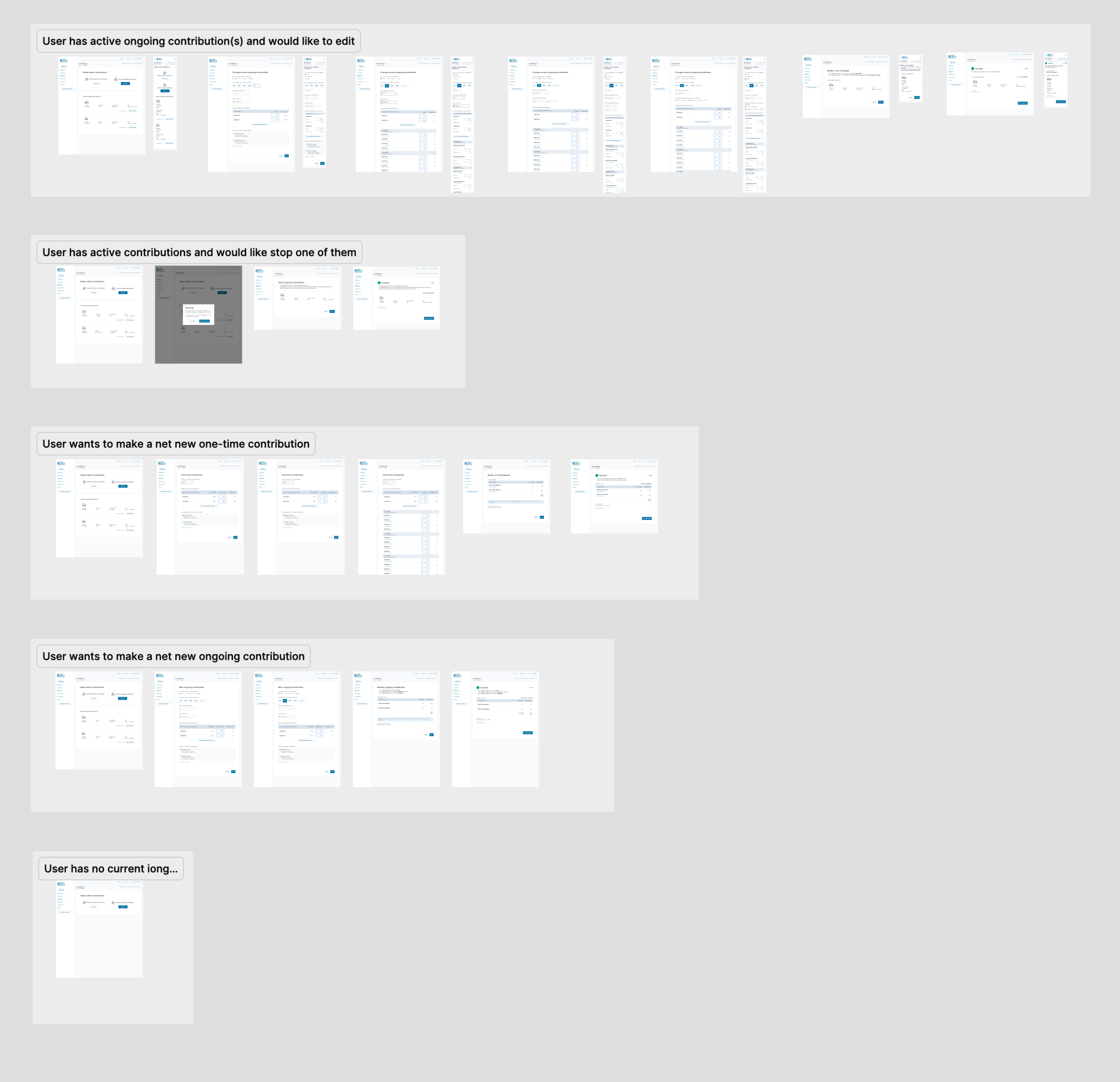
CHALLENGE #1
Making Contributions Clear and Goal-Aligned
Problem: Investors didn’t understand how their contributions translated to outcomes. Financial data lacked clarity and context.
Solution:
Displayed contribution impact (e.g., $75/month = $900/year)
Used visual calculators to show progress toward goals
Linked contributions to performance summaries and forecasted results
Impact: Built user confidence, improved financial understanding, and empowered informed decision-making.
CHALLENGE #2
Enabling Flexibility Within the Tool
Problem: Rigid tools limited user autonomy. Investors couldn’t easily edit contributions or adjust investments.
Solution:
Enabled direct editing of contribution tables
Supported one-time and recurring contributions on the same screen
Allowed multiple withdrawal types in one flow
Impact: Gave users more control and reduced friction, boosting satisfaction and reducing support needs.
CHALLENGE #3
Helping Users Feel Informed, Not Overwhelmed
Problem: Too much information, poor structure, and unclear terms lead to confusion.
Solution:
Improved terminology and labeling (e.g., "One-Time" vs "Recurring")
Surface key investment metrics and tooltips
Used graphs, visuals, and infographics to simplify complex data
Impact: Increased comprehension, trust, and ease of navigation across all investor types.
CHALLENGE #4
Reducing Overload from Too Many Options
Problem: Users were overwhelmed by long, undifferentiated fund lists.
Solution:
Introduced search and filtering tools
Highlighted the top 3 recommended options with rationale
Collapsed or grouped similar funds and showed relevant summaries
Impact: Improved decision-making and made investing feel manageable, not paralyzing.
CHALLENGE #5
Avoiding Questions Users Can’t Answer
Problem: Investors were asked confusing questions they weren’t prepared for.
Solution:
Reworded industry jargon into simple, understandable prompts
Provided helpful guidance and clear follow-ups for complex options
Moved confusing questions later in the flow and separated them into manageable pieces
Impact: Reduced drop-off, confusion, and user anxiety. Boosted confidence in navigating the platform.
Outcome & Reflection
The redesigned portal met modern accessibility and responsiveness standards, aligned with brand guidelines, and delivered a more empowering, user-friendly experience. By integrating feedback into every sprint and focusing on clarity, flexibility, and support, the team delivered over 50 targeted UX improvements that had lasting impact.
This project reinforced the value of leading with empathy, designing with data, and iterating with intention. The result was a platform that not only looks modern, but makes investing in education approachable and effective.