Increased Sales by 38% in Two Months
Business Opportunity
When Quantum Fiber launched, Lumen needed to differentiate it from its legacy copper-based services by presenting it as a fully digital, fiber-to-the-home platform offering faster, symmetrical gigabit speeds, improved reliability, and a modern, subscription-based model complete with advanced features like integrated Wi‑Fi 7 and app-based controls, ensuring customers understood the clear benefits for today’s data-intensive applications and smart home needs.
The new Quantum Brand needs to explain:
Key Differentiators
Products and expanded offerings
Benefits of Fiber Technology
Process
At Lumen, the UX/UI team adhered to the Double Diamond process, a design framework that divides work into two main "diamonds" of divergent and convergent thinking. The first diamond involves "Discover" and "Define" phases, where designers gather data, explore insights, and narrow down the problem. The second diamond comprises "Develop" and "Deliver" phases, where potential solutions are generated, prototyped, and refined through testing before final implementation.

Our process began with a comprehensive data gathering phase, which encompassed both discovery and synthesis. We started by identifying key stakeholders and crafting a clear vision statement, while meticulously documenting requirements to ensure every need was understood.
Next, we developed detailed personas and defined a precise problem statement that informed our design direction. Along with crafting testable hypotheses, we shared our workflow and built a robust information architecture to guide the project.
In the design exploration phase, we conducted competitive analyses and drew inspiration from comparative studies, focusing on interaction design to generate innovative ideas and solutions.
We then moved into design selection, refining our visual design concepts through iterative stakeholder and design reviews, and culminating in rigorous user testing to validate our solutions and ensure a user-centered final product.
The Project
The buy flow is the core of the customer journey, transforming interest into transactions and directly impacting revenue.
A well-designed buy flow is critical because it guides users smoothly from initial interest to final purchase, minimizing confusion and drop-offs along the way. By creating a clear and intuitive sequence of steps, you help reduce friction, build trust, and enhance the overall customer experience. When customers feel informed and confident at every step, they’re more likely to complete a purchase, ultimately boosting customer loyalty and revenue.
Business leaders challenged our team to enhance both the UX and UI design, requiring us to integrate add-ons into the flow, notify users when Quantum Fiber isn't available at their address, and promote a managed WiFi option. Additionally, we were tasked with designing for edge cases, clearly communicating the next steps, and incorporating updated legal statements.
My Role
As a Senior Lead UX Designer, I defined the user experience strategy and guided the design process from initial research and prototyping to iterative testing and final implementation to ensure a seamless and engaging customer buy flow. Throughout the process, I collaborated with cross-functional teams, incorporated stakeholder feedback, and delivered clear design documentation and dev-ready artifacts.
Customer Problem
Customers expect to be able to buy internet service online the same way they buy a pair of shoes. In the simplest of terms, our customers would tell us:
“I need to buy fast internet, and I want to accomplish this online, quickly, and easily without having to call.”
Unfortunately, they often face challenges such as changing pricing structures, confusing contract terms, and overwhelming technical details that make it difficult to understand what they're getting. Many struggle with comparing plans and features, understanding service availability at their address, and evaluating the true value of add-ons and promotions.
Hypothesis
Delivering an experience that is simple, snappy, and modern… that answers visitors’ top burning questions quickly:
…will convey and reflect the quality and speed of Quantum’s Fiber internet,
…resulting in short page dwell (as visitors “get” the message quickly), a high number of Loop Quals (Address Checks)
…and a high conversion rate of people purchasing our service.
Vision Statement(s)
Our vision was to showcase Quantum Fiber’s commitment to simplicity, speed, and modern design by creating a seamless experience that’s easy to buy, set up, and use with minimal steps and mental effort.
Demonstrate the core tenets of the Quantum brand by being simple, responsive, snappy (fast), engaging, and cutting-edge/modern.
Create an experience that conveys Quantum will live up to its promise to customers by being easy to buy, set up, and use, with exceptional support and service.
Empower customers to complete their purchase using the least number of actions (clicks, scrolls, etc.) and the least amount of cognition
New Customer Buy Flow

Buy Flow Evolution
The first QF buy flow design was designed in stealth mode for the initial brand launch. The ux and ui were rushed and focused on migrating existing CenturyLink customers, which lacked key functionality.
Steps were taken to improve the existing customer flow, and this design would evolve the new customer experience.
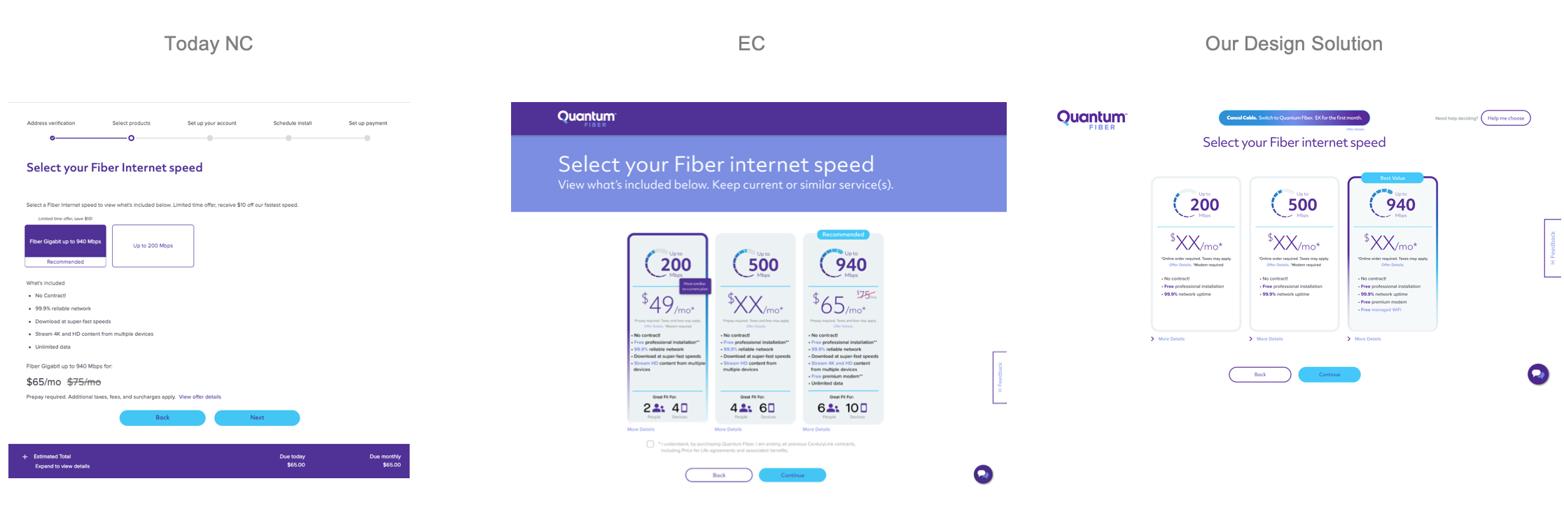
Overall UX/UI Improvements
The action area with the main content lives in the middle.
The core page elements, like the logo, buttons, content containers, and headlines, are in a fixed position, consistent from page to page
Subheads, legal, callouts, etc., and other supporting elements are placed in a consistent and designated place to simplify the experience, reduce cognition, ensure ease of use, and increase advancement.
Consistent button placement
Static, hover & multi-selected states
Scaled down font-sizes, padding, etc.
Now above 768px fold
Removed header
Created a flex space for offers
Set reduced card heights
Fixed position for elements
Consistent action area

Page Specific UX/UI Improvements
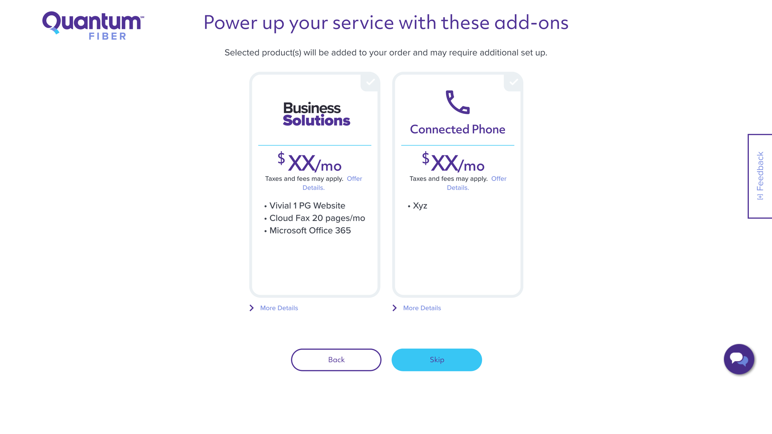
Add-ons
Introducing Add-ons into the flow
Multi-card selection (2 or more)
Ability to scale with future add-on products
Future setup & quantity options

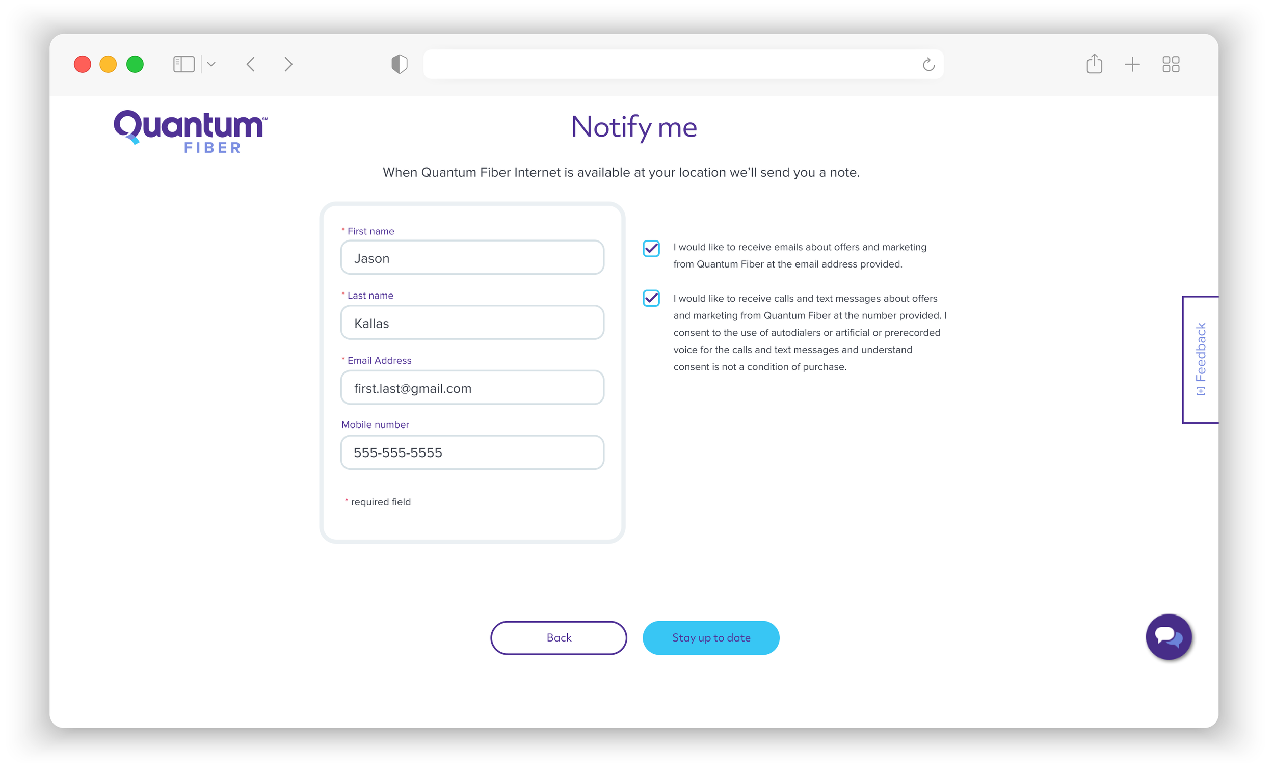
Not Available
Communicate what happened
Basic form
Clear & expected exchange
Communicate what happened
Favorable next steps
Transition with logo and offer
Managed WiFi
Managed WiFi comes with a 940 plan
940 plans automatically get a modem
Offer includes Plume Pods
Benefits messaging
Other plans require modem selection

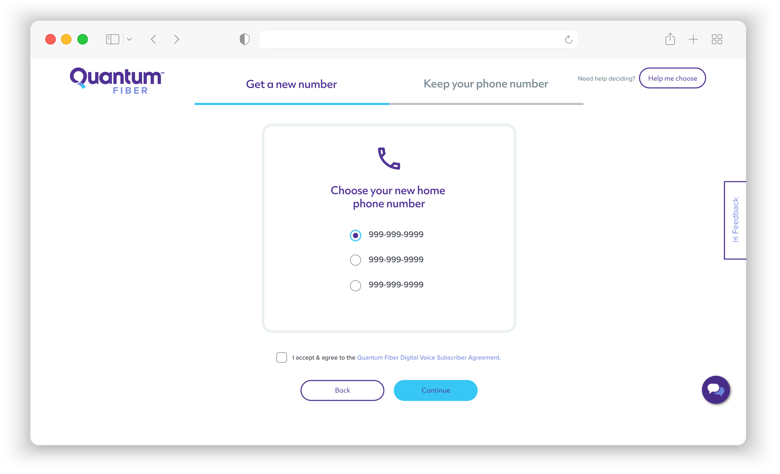
Edge Case Options
Check the current number
Consistent button placement
Incorporated legal requirements
Battery Backup Unit below the buttons
No content change from the existing customer flow
Next Steps
Introduced “Next Steps” actions
Prominent content blades with imagery
Date and benefit-driven CTAs

Confidence Level: UX Table of Elements
Initial confidence level rating of 75%.